
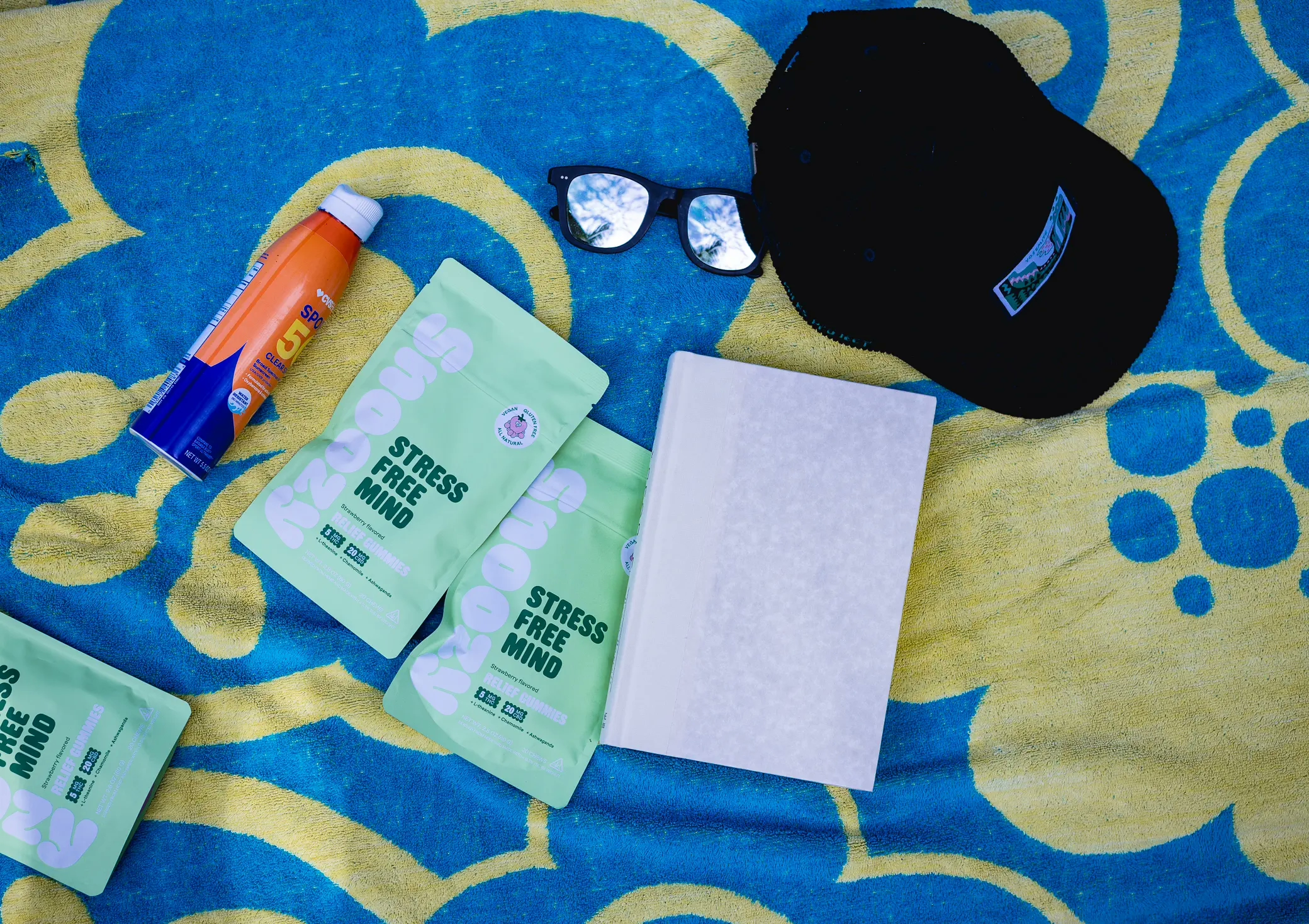
Brand aesthetic photography stays consistent when you fix a few decisions before the shoot and repeat them: the quality and direction of light, a color palette, focal lengths and framing, a short list of props and locations, and one editing recipe. Write those choices down and each new image matches the last.
Key takeaways
- Consistency comes from repeated decisions on set. An editing preset finishes the look but cannot create it.
- Light does most of the work. Pick one light quality and one color temperature, and record the setup.
- Limit the variables: two focal lengths, two or three camera angles, one prop kit, a handful of locations.
- Put the choices in a one-page checklist so a second photographer, or you with a phone, can match the set.
What makes brand aesthetic photography look consistent?
A set of photos looks consistent when the viewer sees the same light, the same colors and the same distance from the subject in frame after frame. Subject matter can change. A coffee bag, a barista portrait and a shot of the counter read as one brand if those three things repeat.
Marketers put a number on this. Lucidpress’s 2019 State of Brand Consistency report, a survey of more than 200 organizations, reported that consistent branding can raise revenue by as much as 33% and that 81% of companies deal with off-brand content. Lucidpress sells brand-templating software and the figure is a survey finding, so read it as what marketers believe more than a measured result. Off-brand content in a photo library tends to look the same wherever it turns up: images from four sources, edited four ways.
Brand aesthetic photography runs on five levers. I set the first four on the shoot and the fifth at the computer.
How does light quality set a brand’s look?
Light sets the mood of a photo before color or props do, so decide on it first. You are choosing two things: how hard or soft the shadows are, and how warm or cool the light is.
Soft light from a large source wraps around a product and gives gentle shadow edges. Hard light from a small source draws crisp shadows and deeper contrast. A skincare brand that wants a calm feed and a hot sauce brand that wants punch should light in different ways.
Two public brand guides show how specific the choice can be. Starbucks’ public photography guidelines call for soft, directional, warm light in studio images and use graphic shadows to add interest. IBM’s photography tips and techniques tell photographers to use natural light or simulate it, and to avoid golden-hour warmth and color grading. The two companies chose opposite color temperatures, and each wrote its choice down.
What I record on set
- The light source and modifier, for example one large softbox or a bare window.
- Its position: side, height and angle to the subject.
- Fill: a white card, a black card or none.
- White balance as a fixed Kelvin value. Auto white balance shifts from frame to frame and breaks a set.
With those four notes I can rebuild the light six months later for a new product and it will sit next to the old images. My food photography lighting guide shows the same idea for plates and drinks.
How do you choose a color palette for brand photos?
Start with your brand colors and add neutrals. Pick one or two brand colors that can appear in backgrounds, props or wardrobe, then choose the neutral surfaces that surround them, such as white, warm wood or gray stone. Keep the list short enough to fit on an index card.
Then decide where color is allowed to show up. In a product shot the packaging carries the color and the set stays quiet. In a lifestyle shot a napkin, a wall or a shirt can echo the brand color. If a color is not on the card, it stays out of the frame.
Accurate color matters as much as matching color. A shopper who receives a teal bottle that looked blue on screen has a reason to send it back. I recommend shooting a reference target such as the ColorChecker Classic, a card of 24 standard color patches, in the first frame of each lighting setup. The editor sets white balance and a camera profile from that frame and applies it to the rest.
Which lens and framing choices keep images consistent?
Choose two focal lengths and a few fixed camera angles, and use them for the whole library. Focal length changes how a product’s shape renders: a wide lens up close stretches the near edge of a box, and a longer lens from farther back keeps its sides parallel. Mixing the two across a product grid makes identical packages look like different sizes.
For product work I suggest three angles: straight on, about 45 degrees and overhead. Record the camera height and the distance to the product so each SKU fills the frame by the same amount. Agree on depth of field too. Either the whole product is sharp or the background falls soft, and the choice holds across the set.
IBM’s guide goes this far. It names two viewpoints, eye level and aerial, lists the aspect ratios to crop to (16:9, 4:3, 3:2, 2:1 or 1:1) and asks for sharp focus across the frame. Write your own rules at the same level of detail.
Framing includes empty space. If your website hero carries a headline on the left, each hero photo needs clean space on the left, so tell your photographer where text will sit before the shoot.
How do props and locations support the look?
Props and locations support the look when you treat them as a kit you reuse. Build one box: two or three surfaces, a few neutral dishes or tools, and one or two items in a brand color. Photograph the kit and keep the picture with your brand guide, so the look of your brand aesthetic photography does not depend on memory.
Starbucks applies this to glassware. Its guide specifies a pint glass for most cold drinks and a modern glass mug for hot ones, and says props should complement the focal point.
Locations work the same way. Pick two or three places that suit the brand, such as your shop, one outdoor spot and a studio, and note the time of day the light works in each. South Florida sun at noon gives hard shadows and squinting faces, and the same patio at 8 a.m. gives a softer picture, so write the hour next to the address. For more on surfaces and sets, see my product photography background ideas and the comparison of lifestyle and studio product photography.
How do editing presets keep a photo set consistent?
A preset keeps a set consistent by applying the same saved adjustments to each file. Adobe’s Lightroom Classic help page on presets describes a preset as pre-defined settings for adjustments such as exposure, contrast, saturation and color grading, and lets you choose which settings a custom preset stores.
I build one preset per brand from the first approved image. It holds the camera profile, the contrast curve and any color shifts, such as muted greens. It leaves out exposure and white balance, because those belong to each lighting setup. I apply the preset to the full shoot, then correct exposure image by image.
A preset has limits. It cannot turn window light into flash or pull a mixed-light restaurant interior into line with a studio packshot. If two images look different before editing, the preset will give you two different images with the same tint.
Ask your photographer to keep the preset on file and apply it to each future shoot. Then skip the app filters. A filter stacked on an edited file shifts color away from the product in the customer’s hand.
A consistency checklist for your next shoot
Copy this table into your brand guide. Fill in the middle column once and check the right column before each shoot.
| Lever | Decide once | Check on each shoot |
|---|---|---|
| Light | Soft or hard. Warm, neutral or cool. Direction of the key light. | Same modifier and position. White balance set in Kelvin. |
| Color | One or two brand colors plus named neutrals. | Nothing off-palette in frame. Reference target in the first frame. |
| Lens and framing | Two focal lengths, two or three camera angles, depth of field, crop ratios. | Camera height and distance match the last set. Space left for text. |
| Props | One kit, photographed and listed. | Kit packed and clean. No new props without sign-off. |
| Locations | Two or three places with the hour noted. | Booked at the same time of day. |
| Editing | One preset built from an approved image. | Preset applied before per-image corrections. No app filters after export. |
| Delivery | Crops for each channel and a file-naming pattern. | Each hero delivered horizontal, square and vertical. |
When should you break your own rules?
Break them on purpose, for a reason you can name. A holiday campaign or a product collaboration can carry its own look for a few weeks. Marketplace listings follow the platform’s rules ahead of yours: a main image on Amazon sits on a white background whatever your palette says, and my white background product photography guide covers that format.
A small business with ten products and one Instagram account does not need a 40-page guide. One page, one preset and one prop box cover it. Add rules when a second person starts making images for the brand.
Frequently asked questions
What is a brand aesthetic in photography?
A brand aesthetic is the repeatable look of your images: the quality of light, the color palette, how close the camera sits and how the files are edited. Customers should recognize a photo as yours before they see a logo. You create it by making those choices once and applying them to each shoot.
How do I keep my Instagram feed consistent?
Shoot in the same kind of light, keep to a short color palette and edit each image with one preset. Plan content in batches so a week of posts comes from one or two sessions. Mix product, people and detail shots, and keep the light and editing constant across all three.
Should I use the same preset on every photo?
Use one preset for the brand, then adjust exposure and white balance for each lighting setup. A preset applies identical settings to different files, so a dark image stays dark. Treat it as the base of the edit. If images still clash after the preset, the light on set was different.
Can I get a consistent look with different photographers?
Yes, if you give each photographer the same written brief. Include reference images, your lighting and color rules, camera angles, the prop list and the editing preset. Ask for a few test frames before the full shoot. Without a brief, two capable photographers will deliver two different styles.
How many brand colors should appear in photos?
One or two brand colors plus neutrals is enough for most small businesses. The product or the person stays the focus, and color supports it through a background, a prop or wardrobe. More colors make a feed harder to match from shoot to shoot and compete with your packaging.
Get a photo library that looks like one brand
Send me three of your own images you like, three from brands whose look you admire, your brand color codes and a list of the products or people to photograph. I will reply with a lighting and color plan, a shot list and a quote. Read more about my brand photography in South Florida or see commercial photography rates first. Send your reference images and product list through the contact page.

